Creative Process
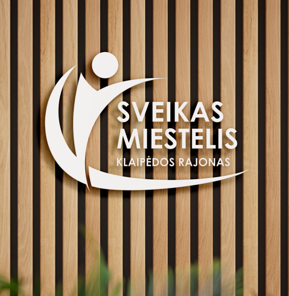
When designing the logo, we focused on the individual as the central element of a healthy community. The stylized figure symbolizes activity, vitality, and openness, while the dynamic shapes reflect growth and forward movement.
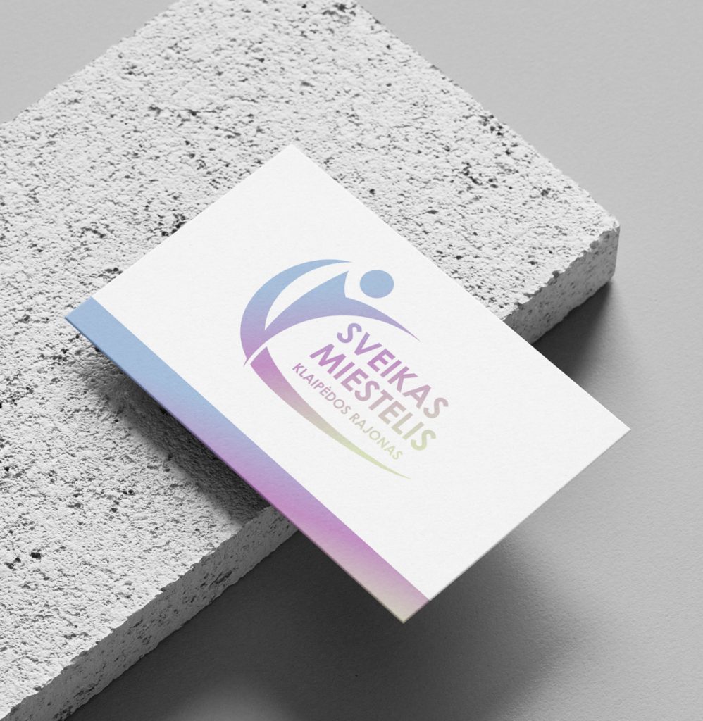
A soft color gradient was chosen to create a modern, friendly, and harmonious identity, representing both health and community unity. The curved lower line reinforces associations of continuity, journey, and a stable foundation — a symbolic path of sustainable healthy town development.

